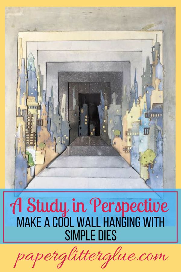
Playing around with perspective with the Tim Holtz Cityscape dies from Sizzix to make this cool wallhanging.
My project for this month's A Vintage Journey is called "City on a Square". Well, I found the idea of creating depth with successive layers of cardboard kind of interesting so I thought I would make a similar project. I played around with dimension and color to improve the depth. This post shows you how add a sense of dimension with the successively smaller cardboard frames.
Rather that making a square project, I used a rectangle as the basic shape of the project and the Sizzix Cityscape dies from Tim Holtz. Here is the finished piece.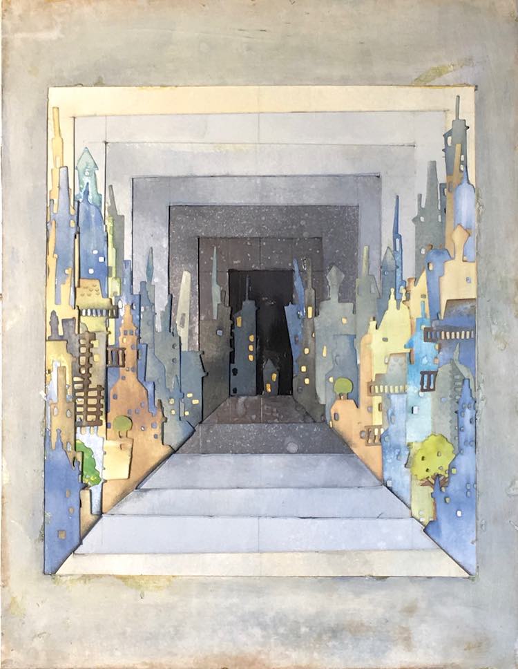
How to increase the illusion of depth
I tried numerous things trying to increase the illusion of depth - black gesso at the center for the start. Darker buildings in the back, yellow illumination of the some windows in the back, gradually using lighter and lighter colors on the borders and the buildings as they get closer to the viewer and the edge of the frame - all help with depth. Also, the I layered more buildings and increased the height as the buildings get nearer. I did not erase my pencil lines from making the frames because it's obvious that this is a study in perspective so the lines are ok to my way of thinking.
How to color the Cityscape buildings
Distress oxides from Ranger were used to color almost everything except the very deep black in the back, even there I put a smattering of Black Soot to just vary the color a little.
Successive photos showing the layers to increase the sense of perspective and depth
Here are a few progress photos so you can see how it came together. Each photo shows the successive layer that was added. I used cardboard for the frames holding the buildings. I didn't add anything behind the cardboard for depth because I was pleased with the perspective as it was. Each frame was one inch larger than the previous one. That gave me ½ inch on each side for the buildings (assuming I centered and cut the frame perfectly which is not really my skill).
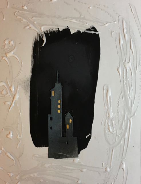 |
| Layer 1 |
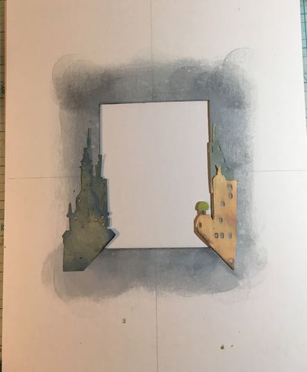
 |
| Layers 1 and 2 |
 |
| Layer 3 |
 |
| Layer 4 |
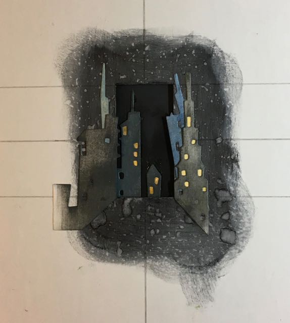
 |
| Layer 5 - more detailed, more buildings |
 |
| Layer 6 - increasing the height, more overhangs |
 |
| Layer 7 - last layer, increasing detail, height and overhangs |
I realized that if I extended the building or balcony or tree past the inner edge of the frame that gave more interest to the picture. Also remember to distress the edges of the buildings so white paper won't show and the building receded better.
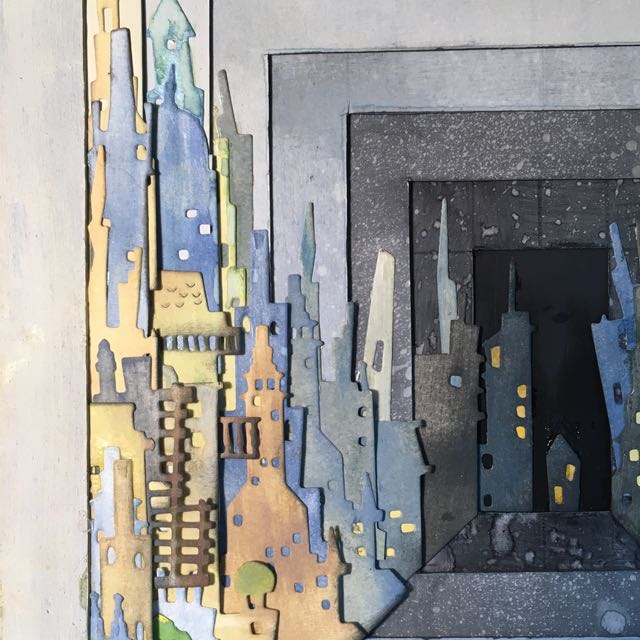
Close-up view of the left side of "The Study in Perspective - Again"
That is this week's non-little cardboard house project. Really fun and interesting to make. I am very pleased with it.
Simon Says Stamp and PaperArtsy Challenges for "A Study in Perspective"
I had 2 challenges in mind when I made this piece. The first one is the Simon Says Stamp Monday Challenge "You've Got the Edge". This project is all about edges since it is edged frame layered over edged frame. That's how these challenges help you - they make you think of things that wouldn't ordinarily come to mind. They stretch your artistic thinking.
The other challenge is PaperArtsy "Dark to Light and Contrasts" which is really the basic idea behind "A Study in Perspective". I love, love the samples they show in the introduction. They are so beautiful. This is a wonderful blog for artistic inspiration. They have great designers who design the most interesting stamps.
I hope you are doing well this summer. Will it be cooler in a month? Maybe.
Pin to your favorite Pinterest Board.
ßeulah ßee
Wow! This is very impressive and you've nailed the perspective. Creating a sense of space and depth is an advanced concept that few
papercrafters pursue but I'm not surprised that you've tried it given your love for the three-dimensional houses. Nicely done!
Sue
This is amazing, I love how you've layered the houses xx
Laney
Lucy - this is beautiful! And so masterfully done. I love how you used color to increase the feeling of depth and perspective. Love the layering. This is an amazing piece.
Hazel Agnew
Great project Lucy. So clever and so effective!
Corrie Herriman
Fabulous !
Trish
Very impressive! Love the perspective
Catherine
Wow, wonderful depth with a unique design. So clever! Thanks for joining us on the Simon Says Stamp Monday Challenge.
Cathie ♥
butterfly
Ooh, I think maybe I like this one even better! The colours on the buildings are right up my street, and I love the elegant shaping of the taller rectangular frames.
Alison x
Ann Barnes
This really turned out fantastic! That perspective is so wonderful and I think one of my favorite parts is how you accomplished it without having to use dimensional tape between the layers, that simply these layers alone worked so well! The color graduation looks great with those oxides too!
Dara Lynn
This is amazing Lucy!!!!
Emma Dawson
Wow, stunning! What a great idea to layer like this.
Jane Castle
Lucy this is wonderful. The colour gradient is so clever and I just love how you get a feeling of going down very shallow steps to the dark and beyond. X