Shark Week Begins
Shark Week on begins tomorrow on the Discovery channel for this year. Of course, I had an idea for a mixed media piece for Shark Week - a tropical island with a surprise in the water surrounding it. It is totally inspired by the Sparkly Tropical Island by Anna-Karin of Layers of Ink who was far more successful with her island that I was. Let me just say it, this piece is not one of my best, but there are lessons to be learned, as always.
Two Versions of the Shark Week Tropical Island Mixed Media
Here's the first version. The slightly improved version is below that.
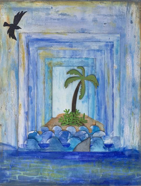
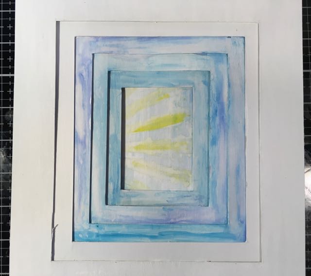
Shark Week Tropical Island Mixed Media piece - the before piece.
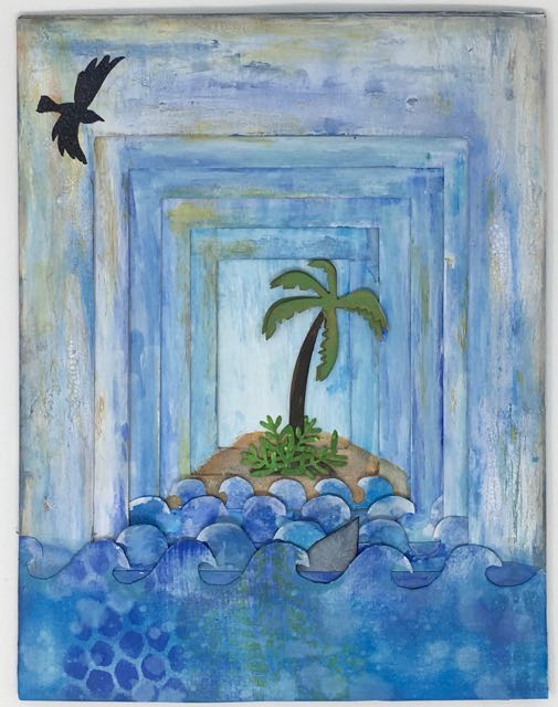
Slightly improved version the Shark Week Mixed Media piece. Still needs work.
A Study in Perspective - Inspiration for the Shark Week Tropical Island Project
The other idea I worked with is something I made last year called "A Study in Perspective" where I cut a series of frames layered with buildings to simulate distance and give a sense of perspective. I wanted to play around with this technique once again.
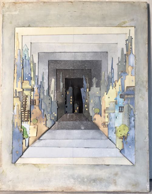
A Study in Perspective Cityscape Mixed Media Wall hanging
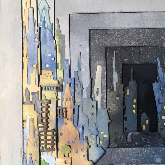
Close-up view of the left side of the Study in Perspective
But I'd like to make a point here - the Study in Perspective was the second one I did last year. The first one was not nearly as successful. So I have to remember that.
Details about the Shark Week Tropical Island Mixed Media Project
For the Shark Week Tropical Island project, the center background is 2 inches wide by 3 inches tall. The rectangle of each frame surrounding the center rectangle is ½ bigger on each side. As I painted each frame, I intended to make each frame lighter in color, but it didn't work out that way. I just kept making the a similar shade of blue which does not give the illusion of depth.
Here's the piece as I started.
Frames cut out for Shark Week Tropical Island
I stenciled the rays of the sun in the background with Distress Oxide inks, but I didn't wait long enough between each shade so blue and yellow = green. Green sun rays just don't work. So I painted over it.
I attempted to add dimension with shading around the center rectangle, but not very successful with that. The first time was too blue. I lightened the second version by painting over it with some gesso, still not the greatest. It's a pretty easy fix to go over the sides. I'll work on it some more.
And then there are waves. I planned to have layers of curling waves, alternating directions. In order to see that, the waves need to be spaced properly. Unfortunately it didn't happen. It's a good lesson to learn - spacing the design elements.
What about the little nub of an island? The island is just this funny little hump in the middle of the ocean. I may be able to extend the paint on one side to break up the symmetry a little bit. I'll try that tomorrow.
You may ask yourself - why am I posting this even if I'm not really happy with it. Good question? Despite its design flaws, it's still kind of cute. But mainly because I learned from it. Here are the lessons learned.
Lessons Learned from the Shark Week Mixed Media Paper Craft
- Sketch out the project a little more before making it
- Take more time in the conceptual stage
- Space out important design elements enough to actually see them
- And remember that you can always paint over colors that don't work
- Play around with the elements of the design before you get out the glue bottle. I was a little hasty with the glue bottle here. That's the real lesson.
But I have another mixed media project in mind that I think will work. This project helps me plan for that one. That's the way we learn, isn't it?
Have a good day.
P.S. I am entering this in the Simon Says Stamp Wednesday Challenge - Use a Die or a Punch.
I am so happy that I found this challenge.
Kim Hamilton
Beautiful card! Thanks for joining us at the Simon Says Stamp Wednesday Challenge 🙂