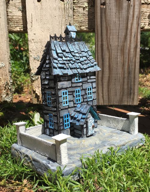
I just finished this house last night. The glue is dry. It's a beautiful day outside so I took photos outside. I have 2 challenges that I would like to share it with - Paper Artsy and Frilly and Funkie challenges.
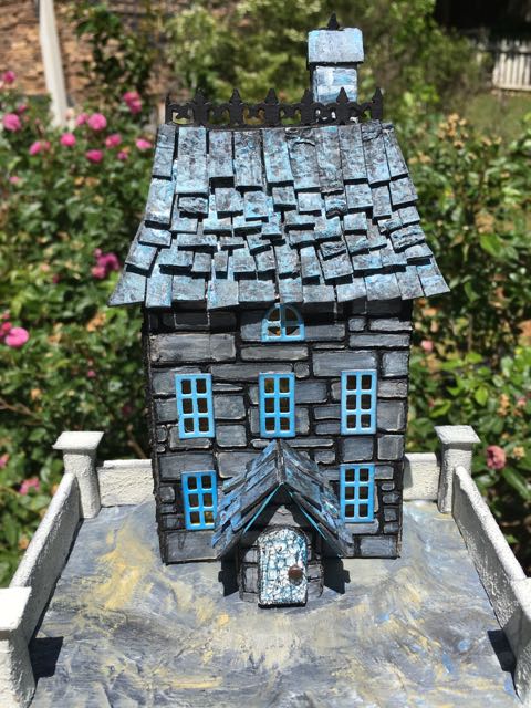
I used the Stamper's Anonymous Slate Stencil by Tim Holtz for the texture on the house. Since this is a Halloween house I painted the "mortar" black to give a little creepy factor. I wanted a little color to the house so I used some blue on the windows and on the slate roof as well as the base. The bricks on the chimney have some blue as well. The colors I used are Tumbled Glass, Broken China and Stormy Sky from Tim Holtz' Ranger crayons and paints and stains.
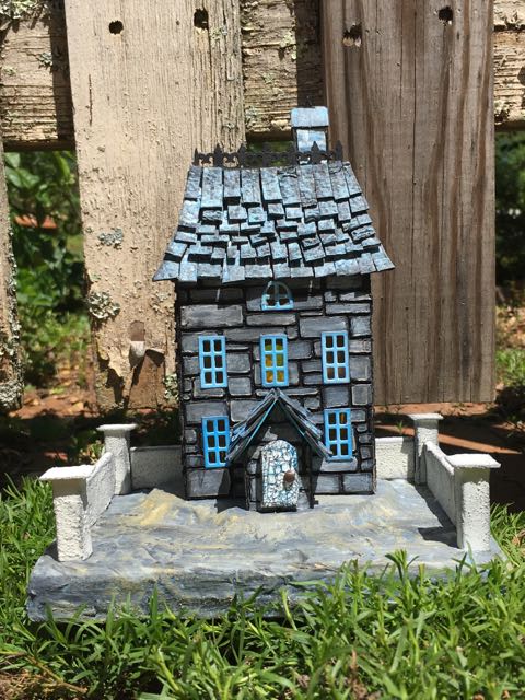
I was happy about two particular details - the rocky base and the fence. I feel like I made the hill the house sits on look more like a hill. I made this fence from scratch. It's cardstock covering a strip of corrugated cardboard painted with gesso with a little ochre in it which was mixed with sand to give texture. I also distressed it with some black soot so the fence would not look too pristine. I like how it defines the house.
I saw a chimney somewhat like this when I went to Virginia to visit Monticello last week. I tried to copy it, but wasn't terribly successful. It's still kind of a cool chimney though. Still wrestling with getting the chimney to be straight up and down. This roof was kind of difficult because it's curved.

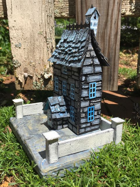
Here are the three stone textured houses. In terms of texture clearly the French house was the most successful. In terms of Halloween, the Slate house has the most spook potential. The Bluestone Creek house has my first water feature which I am very happy with.
Lessons learned (this is where I try to be positive about changes I can make rather than criticizing myself):
1. Proportions are always important. The little portico in the front is a bit to fat for the tall thin house. If I had left out the middle window on the second row, I could have made it taller and skinnier which would fit the proportions of the house better.
2. Again proportion. The slate roof tiles might look better if they were smaller.
3. Competing textures - the slate roof and the slate siding compete with each other. A grey metal roof might be a better choice. Same thing with the door, a less textured door would go better.
Overall, I am very happy about this house. I wasn't until I put in on the base and made the fence. I think that tied everything together.
Challenges:
The PaperArtsy challenge this time is "Found Objects" - while I am not as creative in my found objects as the design team artists - most things in the construction of the little houses are things I have saved from the trash or recycling. The main house cardboard is the backing for labels at the hospital where I work. The base is corrugated cardboard from shipping boxes. The windows are acetate from packaging and on the Slate house, the rough roof texture is from a box for cat litter. Be sure to check out the cool things from "Found Objects".
The other challenge is the Frilly and Funkie challenge "Put Your Inking Cap On" which is to make a project without using designer papers. Sometimes I make a house with designer papers, but lately I have been making my own designs for the siding of the house. No designer papers in this project. Do go to their website and see the "no designer paper" designs they have there.
Thank you for stopping by. I hope you are doing well.
Jenny Marples
Jaw droppingly amazing Lucy!!! They are so carefully finished and beautifully realistic! I am in awe. Thank you so much for joining us at Frilly and Funkie xx
Lucy
Thank you, everyone for your lovely comments.
Lucy
Thank you, Lynn. I always look forward to your comments. Sometime you need to come here to see them before this year's sale.
Paula Whittaker
what fabulous looking houses....great creations x
Lynn Koeppen
These are really cute houses! Your work is so creative! I can't wait to see some of these houses in person!
Monika Gulyas
Wow! Awesome Halloween house! You are such an expert in making Tim's houses! I love it to bits!
Corrie Herriman
So delightful !
ßeulah ßee
What a cheerful little town you are making! True, we all learn by doing and then tweak things along the way, but I am most charmed by creations that show the happenstance of something a little too big or just a little bit wonky. I think your little houses are perfectly imperfect!
Redanne
I just love your latest house Lucy, the slate walls look fantastic and I am in love with the fabulous roof tiles and blue window frames - your wall/fence is superb and really finishes off the house beautifully!! Anne xx